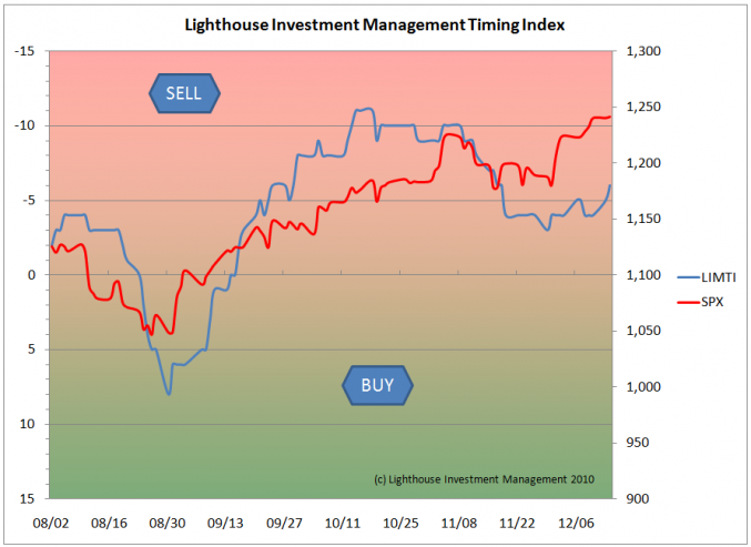
The LIMTI (Lighthouse Investment Management Timing Index) is an experimental project. It is calculated daily on the basis of various statistical readings on the US stock market (mostly S&P 500 Index) to gauge whether the market is overbought (red shaded area) or oversold (green area).
 Below I will go into detail in regards to which components are included in the LIMTI. I should add that all information feeding into the LIMTI is freely available on the web (we use www.indexindicators.com and www.stockcharts.com).
The index “peaked” at -11 (note the inverse scale) on October 18th, slightly ahead of the peak in the S&P 500 index at 1,226 (November 5th). The subsequent new high at 1,242 (December 14) was not accompanied by similarly overbought conditions. However, the LIMTI is still in the “red” zone.
Let’s look at two more components of the LIMTI: the equity put-call ratio. It is the number of equity puts traded on a given day divided by the number of calls. You may say that every trade needs a buyer and a seller (and hence the information gained by looking at the ratio to be worthless). However, the combined expectations of put sellers (expecting flat to positive underlying price development; lets give it a +0.5 “bullish stance”) and put buyers (negative or -1) are different from call buyers (+1) and call sellers (-0.5). Put buyers and sellers have an average “expectation” of -0.25, compared with +0.25 for call buyers and sellers. Hence put buyers and sellers combined expectations are slightly less bullish on the underlying instrument (here: equities). This is why a high number of puts traded relative to calls indicates a bearish sentiment. If the sentiment reaches extremes, a turning point might be reached.
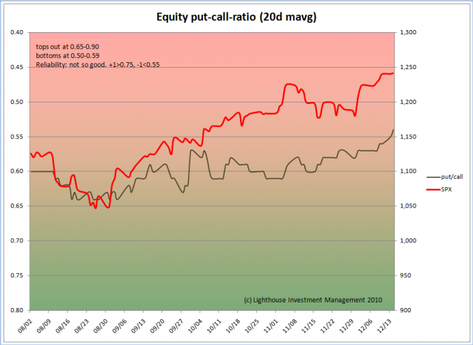
Due to daily fluctuations the put-call ratio has to be smoothed. For the first indicator we chose a 20-day average:
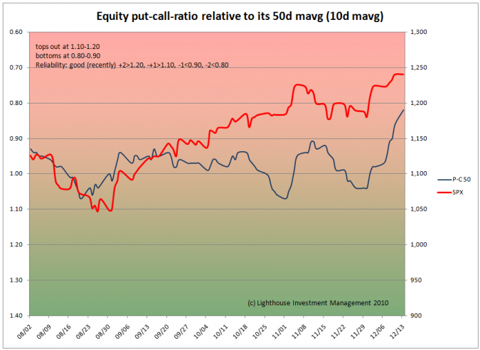
However, has historically (last three years) not been very reliable in alerting to market turning points. This is why we have added a second measure of put-call ratio, calculating it against its own 50-day moving average (smoothed over 10 days). The result is the following chart:
 As usual, we give positive and negative points (+2, +1, 0, -1, -2) according to the number of standard deviations from the mean, and add them all up, resulting in the LIMTI.
I will follow up on other components in the next post.

